Anizon 3D Printing
A local 3D printing business looking to build up a visual presence.
Using modern trends to showcase services and to increase visibility.
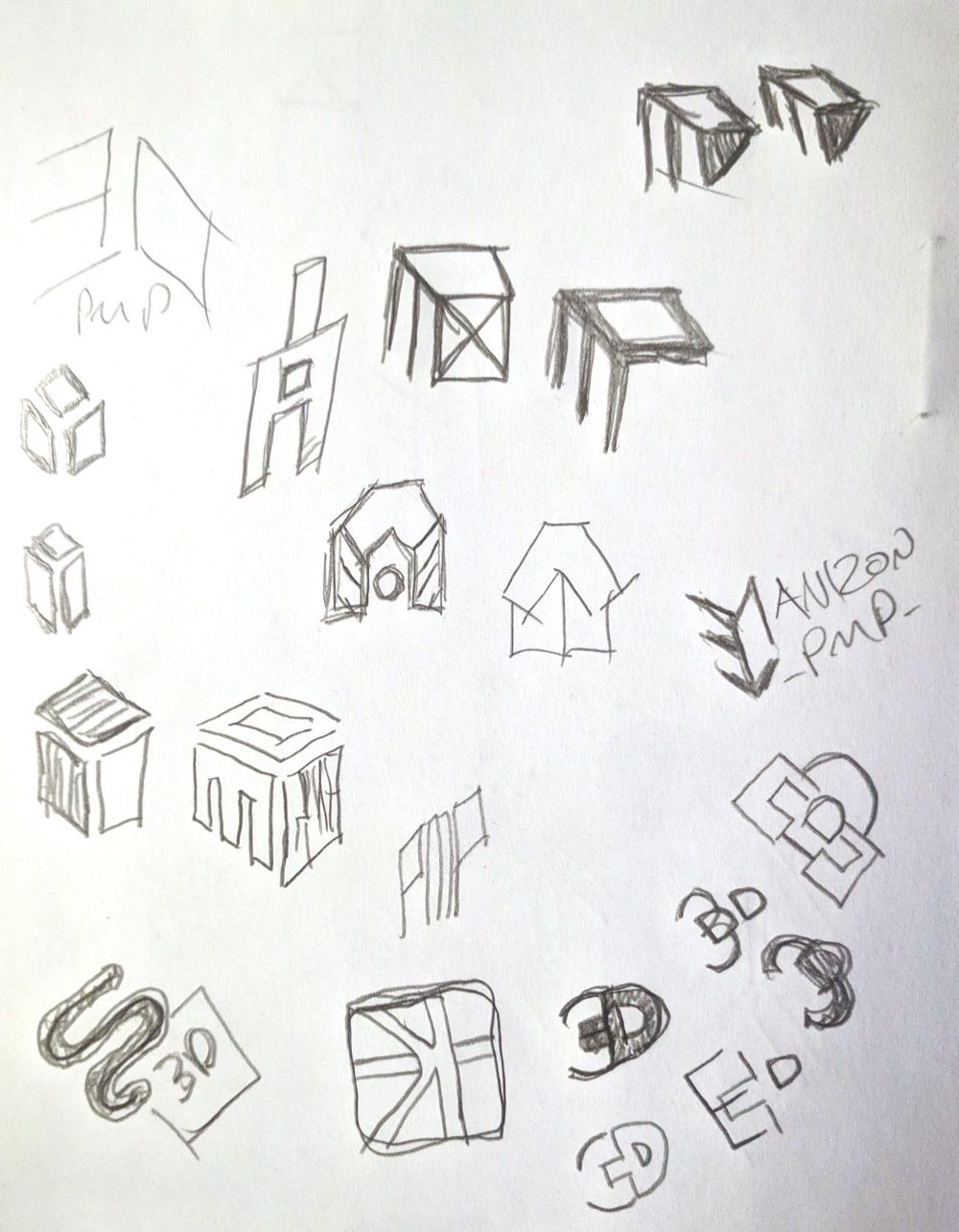
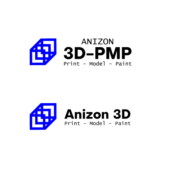
Research and development phase started with a geographically targeted competitive analysis. Typographic exploration took the direction of simple 3D effects to convey the immediate services, leading to abstract icon forms to convey the nature of 3D printing and modelling.
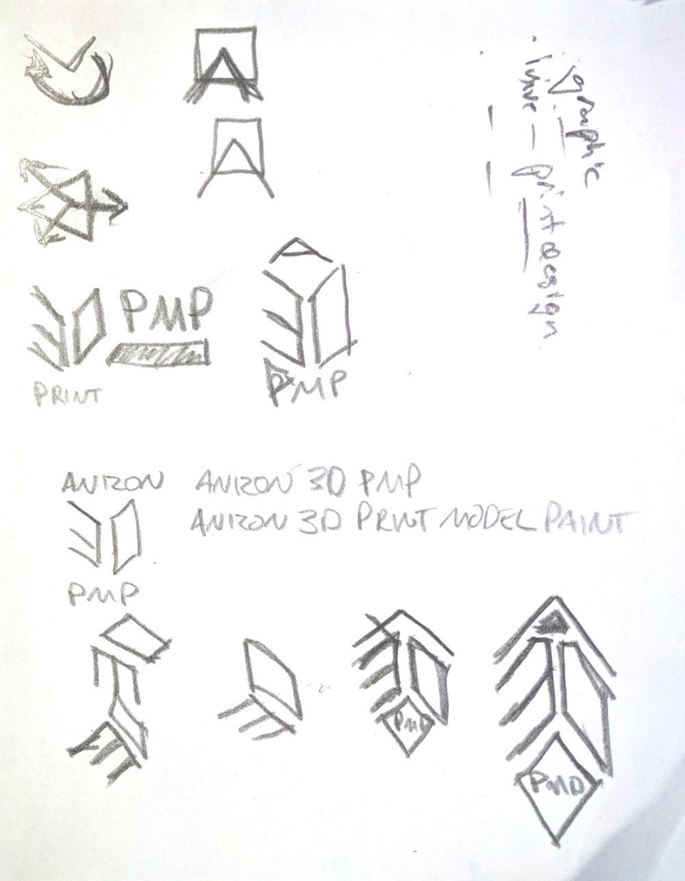
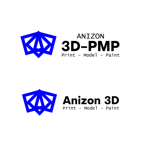
Presenting a project update with the client showed a favoured direction towards the monogram element, the later of the proposed concepts. Although concerns about the definition of the mark were brought up, referring to early concept sketches with a filled background. Further refinement of the mark was agreed upon to solve this issue.
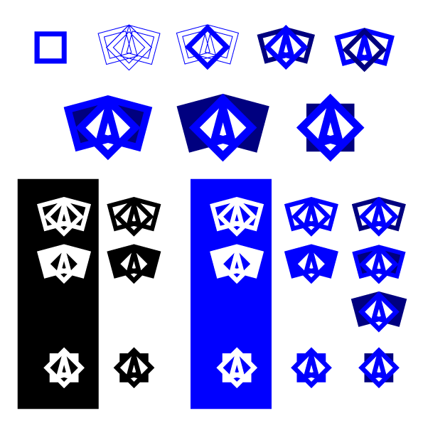
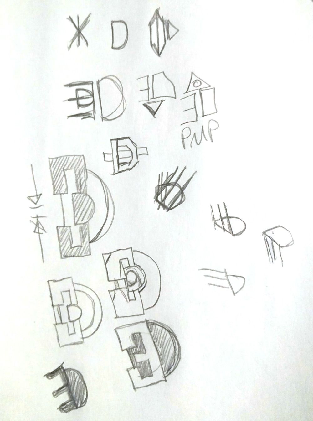
Rebuilding the initial concept, minimising anchor points, re-aligning elements to allow for a streamlined file delivery.
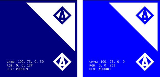
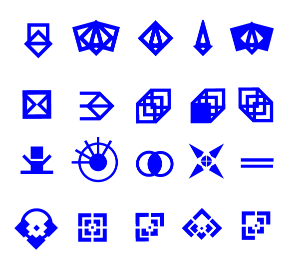
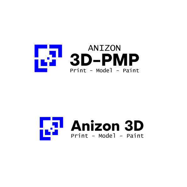
Exploration continued with single colour and two colour options, discovering application viability while also investigating a way to increase the marks definition.
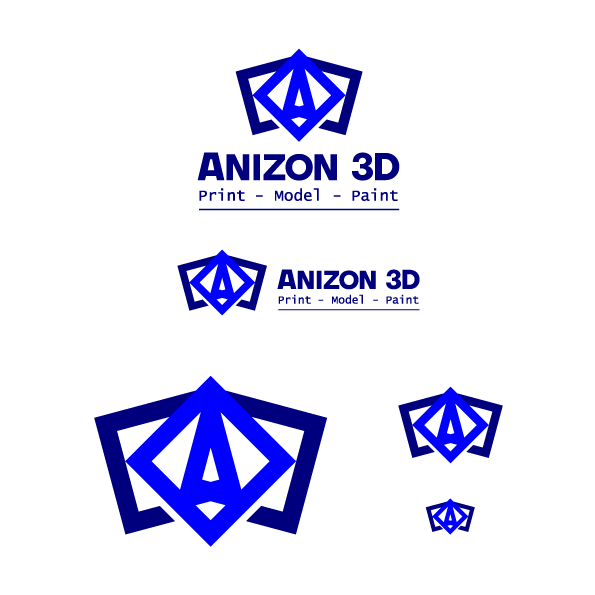
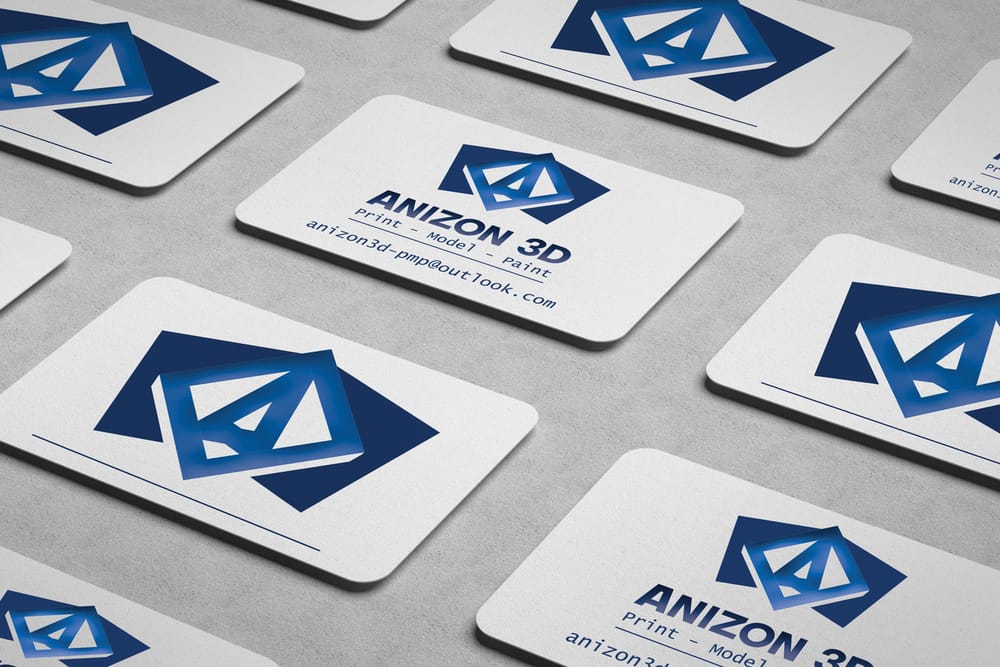
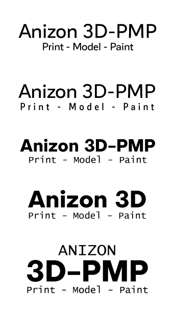
A refined version of the initial proposed mark was presented with two typographic treatments of the word-mark; the first a customised word-mark with tighter kerning and an anchoring stroke below maintains the structure of the logotype; while the second maintains the original font to be more consistent in further collateral, with a more free-flowing layout use the mark as an anchor point.
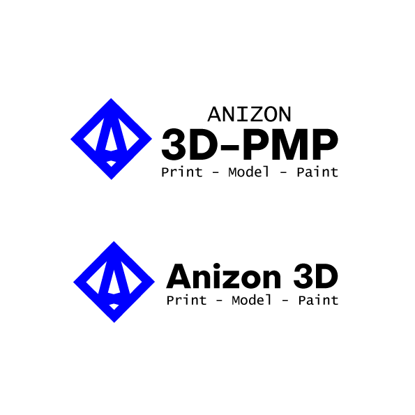
A more pronounced protrusion on the top, with a negative space either side of the base lifted the monogram from the secondary elements. The refined mark presented with more separation increases the definition and creating a greater sense of hierarchy.