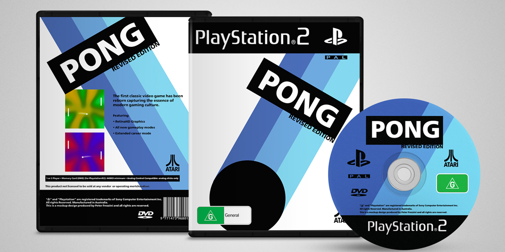
Pong Game Cover Concept
Pong is one of the earliest arcade video games and the very first sports arcade video game. It is a table tennis sports game featuring simple two-dimensional graphics. Pong was one of the first video games to reach mainstream popularity. The game was originally manufactured by Atari, which released it in 1972.
Allan Alcorn created Pong as a training exercise assigned to him by Atari co-founder Nolan Bushnell. Bushnell based the idea on an electronic ping-pong game included in the Magnavox Odyssey, which later resulted in a lawsuit against Atari. Surprised by the quality of Alcorn's work, Bushnell and Atari co-founder Ted Dabney decided to manufacture the game.Pong quickly became a success and is the first commercially successful arcade video game machine, which helped to establish the video game industry along with the first home console, the Magnavox Odyssey. Soon after its release, several companies began producing games that copied Pong's gameplay, and eventually released new types of games. As a result, Atari encouraged its staff to produce more innovative games.
The company released several sequels that built upon the original's gameplay by adding new features. During the 1975 Christmas season, Atari released a home version of Pong exclusively through Sears retail stores. It was also a commercial success and led to numerous copies. The game has been remade on numerous home and portable platforms following its release. Pong has been referenced and parodied in multiple television shows and video games, and has been a part of several video game and cultural exhibitions.

This project was to bring an iteration of the game Pong to the modern gaming industry. While there have been significant advancements across every platform, a sense of nostalgia can be experienced playing this classic. Key aspects were to keep the cover relative to the original branding, and to capture the movement of the game.

This iteration was focused on the angles used during the game, capturing the intensity of a rally. The 3 analogous colours were complemented with blue to bring a more modernist tone when paired with the angular layout. However another solution was sought after losing the nostalgic nature of project, and possibly losing the target audience.

