Team Legacy Branding Refresh
The original logo had a lot of potential and I was approached by the client to help increase the visibility of the organisation so that they could scale a growing community in the eSports industry. With a significant social profile, the brand needed to be refined to align with the needs acquired in growth.
In the first meeting, the client described goals of merchandise including t-shirts, increased social presence across multiple platforms, and an increased web presence. With these goals the limits of the current branding were in sight, a refresh to cope with future growth was on the horizon.
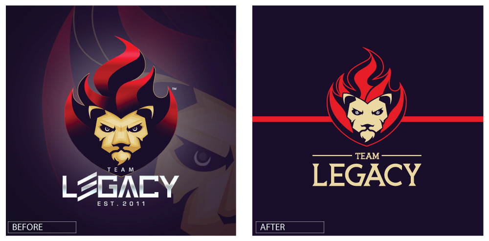
By tackling the branding refresh first, future projects such as merchandise and web presence could be easily implemented when necessary. Laying down the foundation of the brand and building over time as new goals emerge.
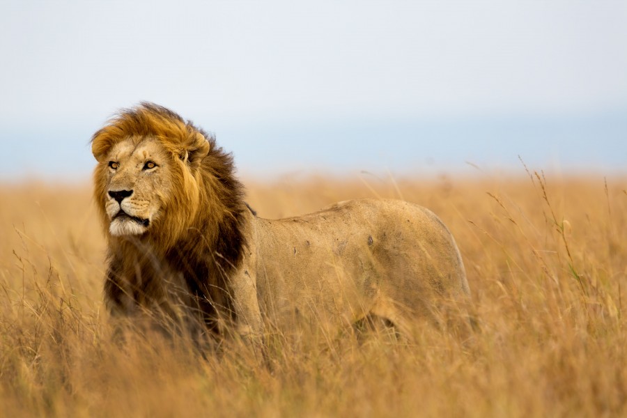
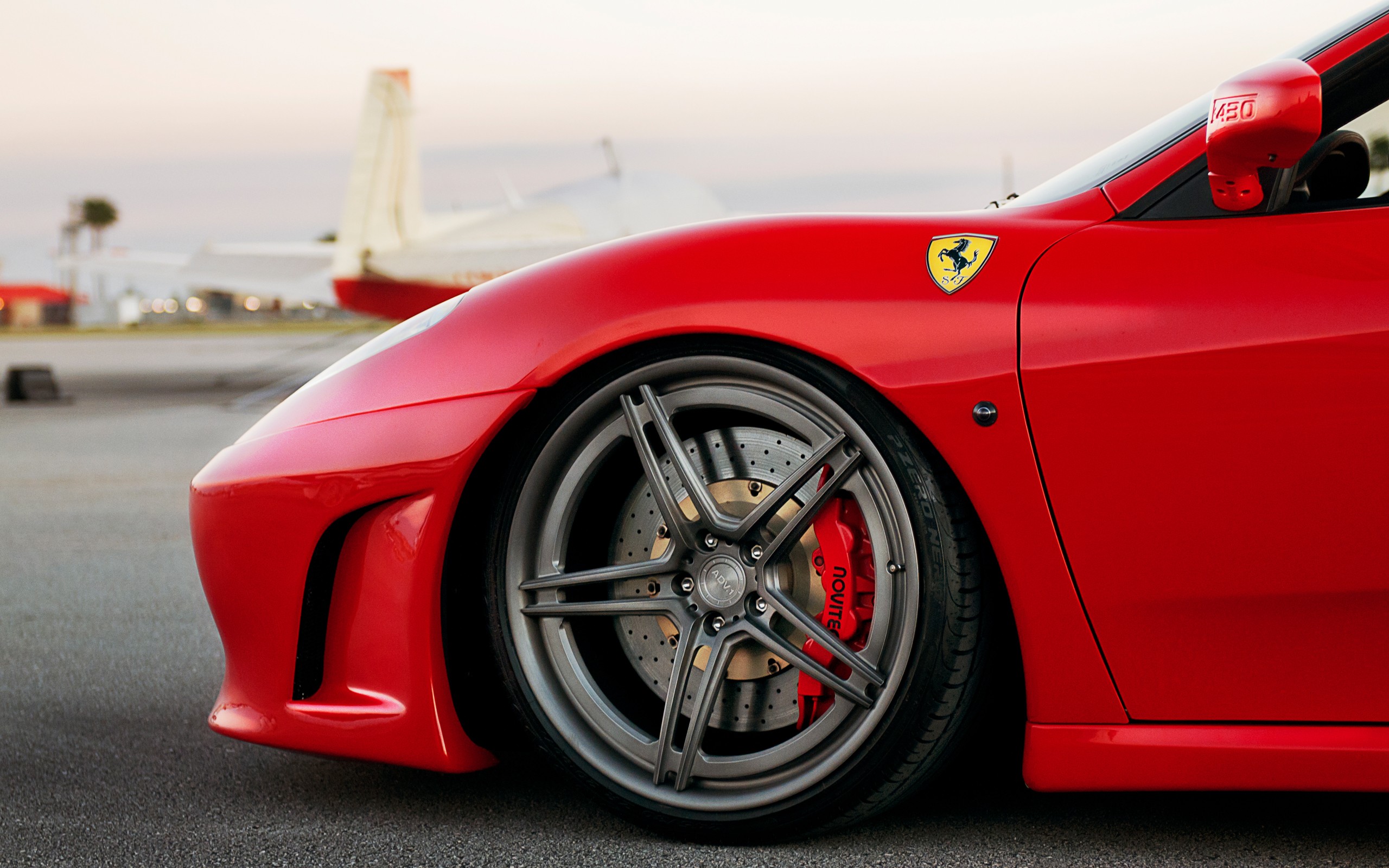
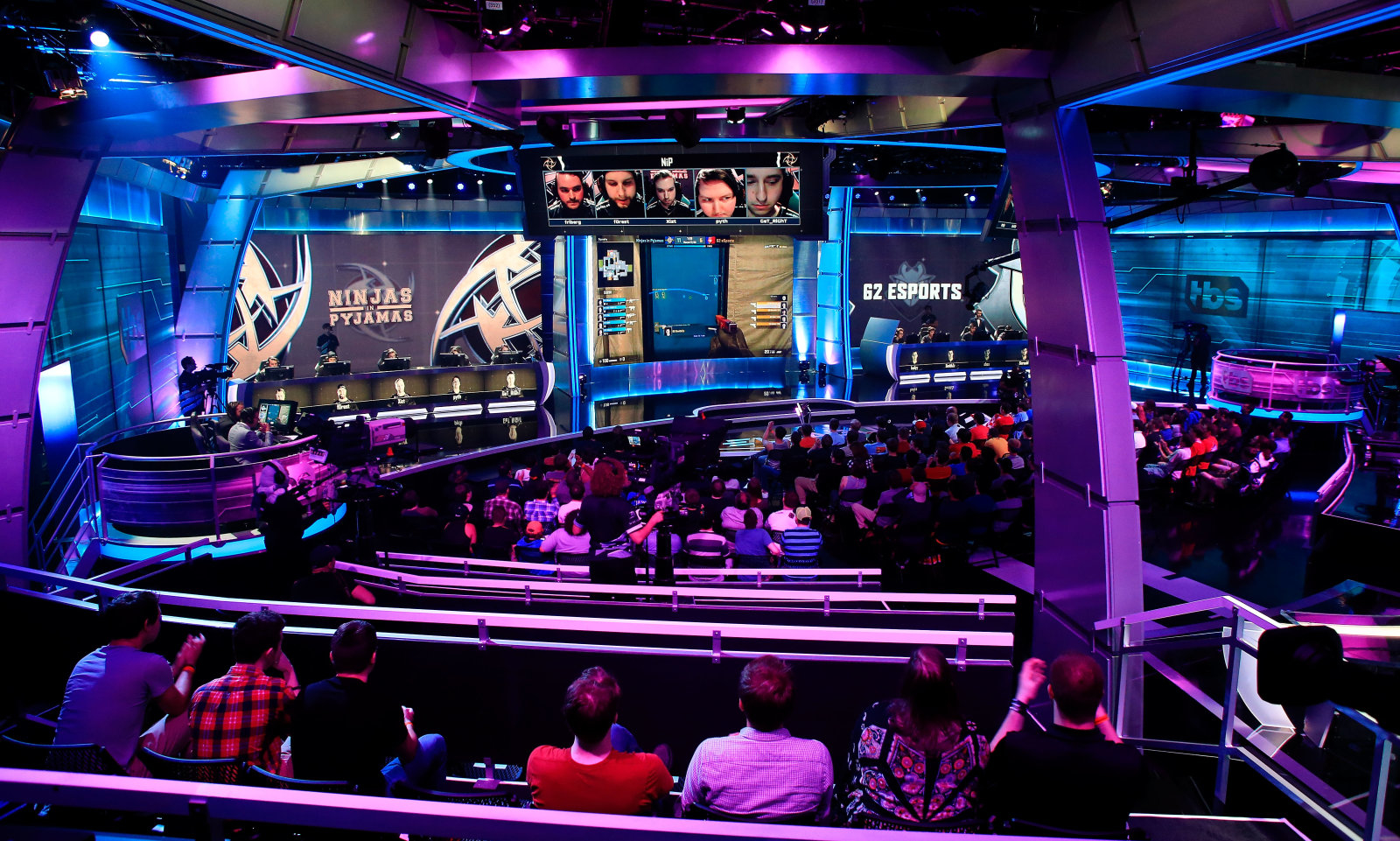
Using the values of the organisation, Pride, Luxury and Sportsmanship. I refined the feel for the brand and used elements for the identity accordingly. The Wheat colour representing the lion, used as an anchor for the mark and type, providing contrast to the purple and harmony with the red. The Ferrari Red and deep Purple are used to both convey luxury and passion, along with competitive spirit. The purple is also dominant in eSports with the clash of red and blue lighting representing two teams competing.

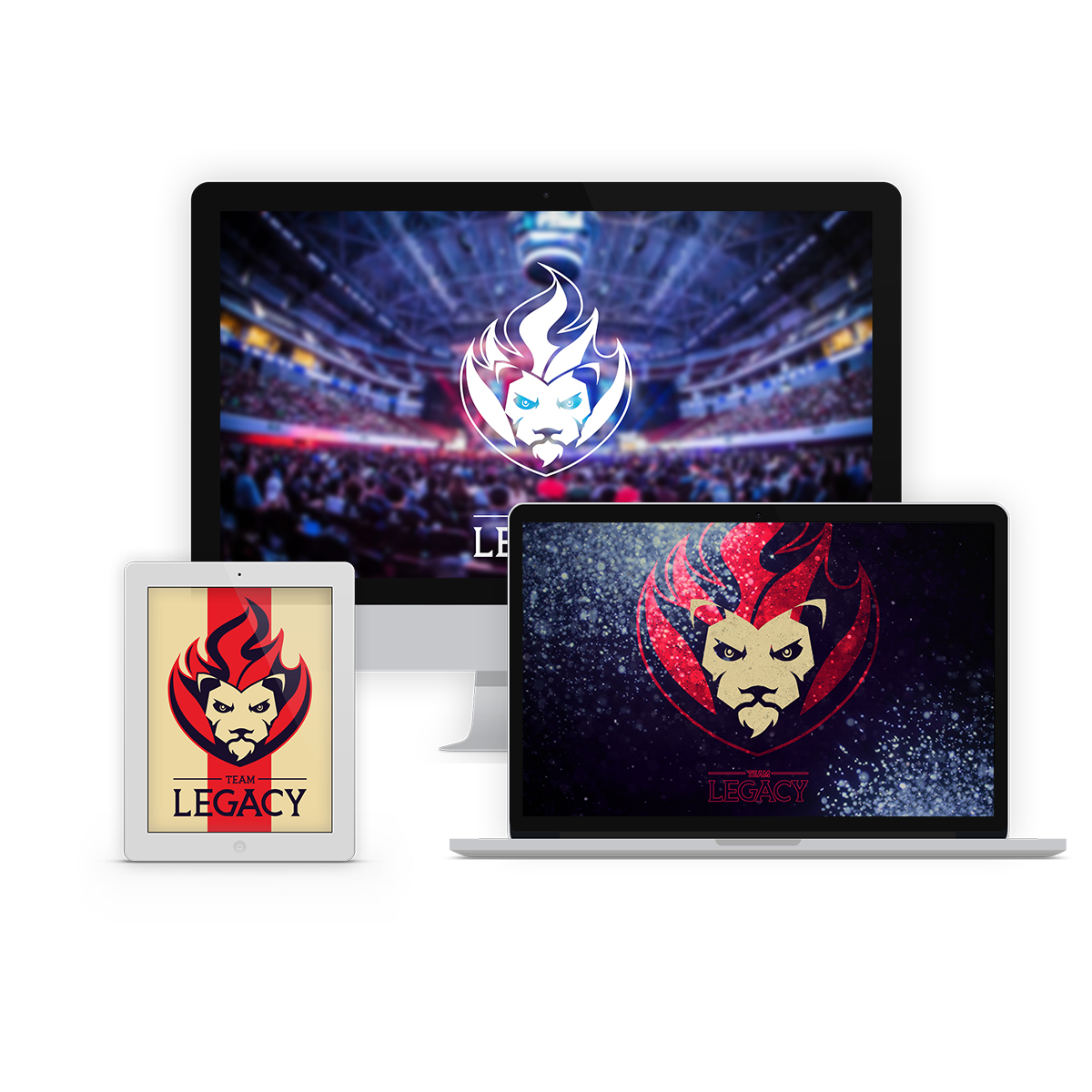
Situational mock-ups of wallpapers on various devices with 3 distinct styles were aimed at different demographics of the eSports community, the fan, the follower and the player. The fan is the one who just plays casually at home, maybe socially when friends come over. The follower is someone who plays and watches the games like any normal sportsman. The players is someone who has completely immersed themselves in the community of the game, gets into the hard mechanics and attends eSports events religiously. These three personas make up a broad base of the gaming community and target messages to each group should have a significant return on investment.
