
![[REVIEW] AGL Brand Refresh](/content/images/size/w1000/2019/03/agl_refresh.jpg)
[REVIEW] AGL Brand Refresh
The Australian Gas Light Company released a press statement regarding a brand refresh
AGL Energy (AGL) today released a brand refresh campaign to demonstrate how it is transforming to meet the needs of energy consumers.
The brand update immediately address the direction of the company although conceptually sound the execution was somewhat lacking. This is something the design community sees all too often. A re-branding using trendy new styles while the core concepts are left hanging, and this is a prime example. Before standing before the firing squad, there are always unexpected factors in a branding process which is why it needs such delicate attention, blaming a single entity is improper and unprofessional. A radical realignment such as this one needs to curve the public conceptions of the company and backlash is to be expected. Professional courtesy aside, there are a lot of questions that need to be addressed about the execution of this project.
The project was constructed by Principles Australia an international agency with a significant client list across a broad range of industries.
The identity was built on the idea of putting power into the hands of people. Bringing innovation and humanity together.
We also crafted a distinctive new voice for the brand, that’s conversational yet straightforward, funny when it’s appropriate, with a touch of Aussie charm.
The biggest question most would ask is, what is wrong with the old logo?
With energy companies coming to a impasse as a result of climate change, the call for sustainable energy production is becoming louder every year. People want to see something change and the problem with industries as big picture as energy infrastructure many changes that are making an impact go unnoticed. AGL have put their money where their mouth is to show the public that they are committed to making the change.
The old logo was dated, it represented the old way of doing things, inside a box. The new logo has broken out of the box, fresh and inviting.
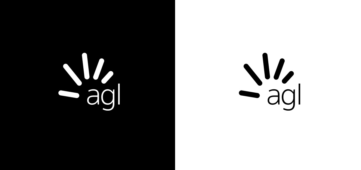
The second biggest question is what is that gradient?
The general web has supported gradients for a long time with the introduction of CSS3, but some browsers have been a little slow on the take. Since Instagram changed their logo in 2016, gradients have become a big deal in the design world with the new, fresh, energetic style aimed towards millennials. Branding is becoming more about how the identity is formed through a variety of media not just the logo.
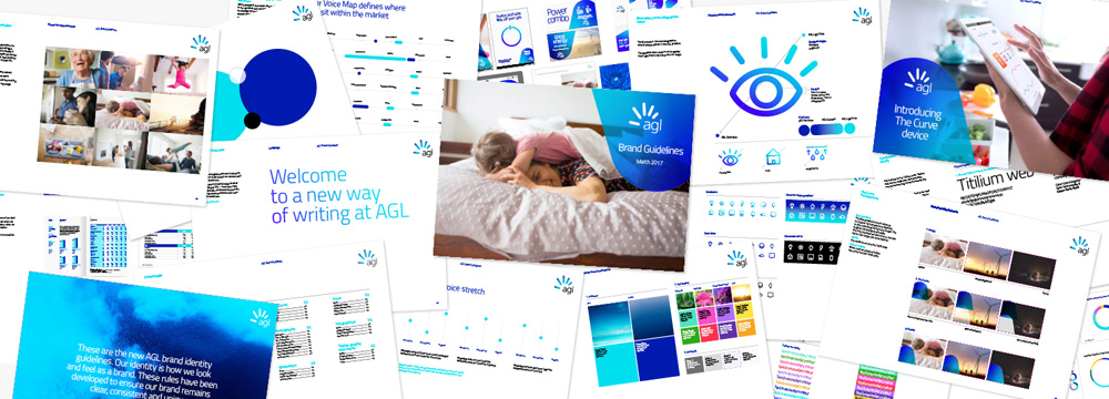
AGL have put together couple of animation videos that really resonate with the brand but the edgy style seems to be a little over-executed for general purposes like a website favicon. The base concept of the logotype is sound and this is the most important part. The subtle negative space gives a nice fan referencing the original mark, the weight of the graphic compared to the text is hierarchically balanced. The identity across the collateral shows a nice consistency with imagery, typography and secondary elements.

The one thing out of place is where the stylistic elements are applied, mainly in the logo itself. At a smaller scale it is less noticeable, but when the logotype becomes the main focus it makes me uncomfortable. Which may not be a bad thing, with change comes a sense of unease but as mentioned earlier it becomes over executed.

A possible solution is to ease the gradient in rather than the straight up black, low-scale gradient, but it becomes apparent that the same visual is used for other companies. With this alignment the brand would fade back into exactly where it was before and every statement it has made about being innovative will become lost with their stakeholders.
In conclusion, lets see how it goes. There seems to be a culture of jumping on top of every newly formed brand identity like a bunch of ravens, which is easy with a detached hindsight. With such a hard pivot it would have been arduous to distinguish a concrete direction that aligns with where the company is heading for the next 20 to 30 years. Maybe we will see a refined iteration over the next few years.
Further Reading