
![[REVIEW] DeBortoli Brand Refresh](/content/images/size/w1000/2019/03/BWSUpdate4.jpg)
[REVIEW] DeBortoli Brand Refresh
The new DeBortoli name has made it's way to the front of the production line. The brand refresh announced almost a year ago is now stocked on the shelf. This is an important consideration when making a shift in branding at any level. That changes that stakeholders see from the genesis may not be seen by the general public for months into the roll-out process.
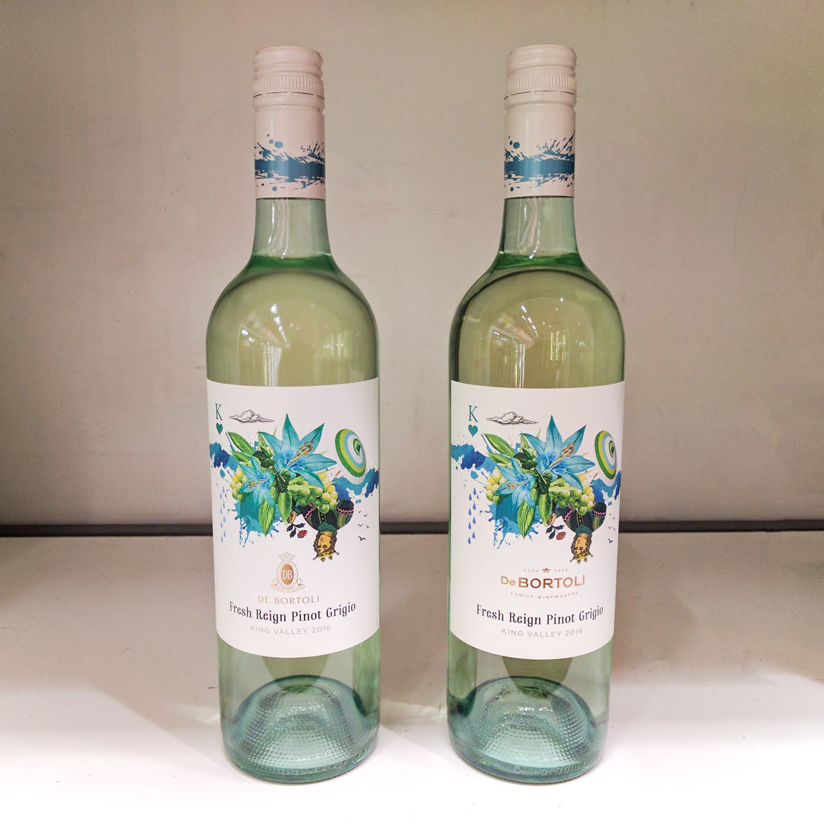
The DeBortoli brand refresh is a combination of subtlety and refinement. The direction of the company can clearly be seen from the visuals and equally explained through their press release.
Being honest and true to ourselves, being proud of who we are, making wine that people enjoy drinking, making wine that we enjoy drinking. Showing respect for the way we farm our land to set the foundations for the future generations.
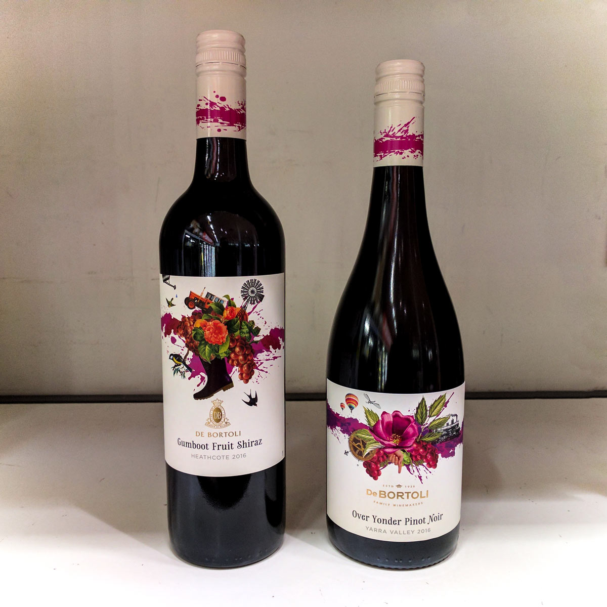
Bringing focus back to their name, the logotype reinforces a clear hierarchy, from attention grabbing visuals to brand recognition to product name. While the visuals do seem to be overcompensating, the presence is necessary with the amount of visual noise surrounding a wine label in a retail outlet.
The logotype itself diverts from the accompanying mark, using a modern, mostly uppercase sans serif. The crown and established dates overarching the name bring the legacy of the family with a more direct tagline "Family Winemakers" arching beneath. The gold foil finish adds a respectability without overstepping, a suitable trait to keep from the previous label, and reinforcing continuity through the overall composition.
Further Reading