
![[REVIEW] Bulmers Brand Relaunch](/content/images/size/w1000/2019/03/BWSUpdate5.jpg)
[REVIEW] Bulmers Brand Relaunch
If you have seen this already I'm going to direct you to my last article where I said:
That changes that stakeholders see from the genesis may not be seen by the general public for months into the roll-out process.
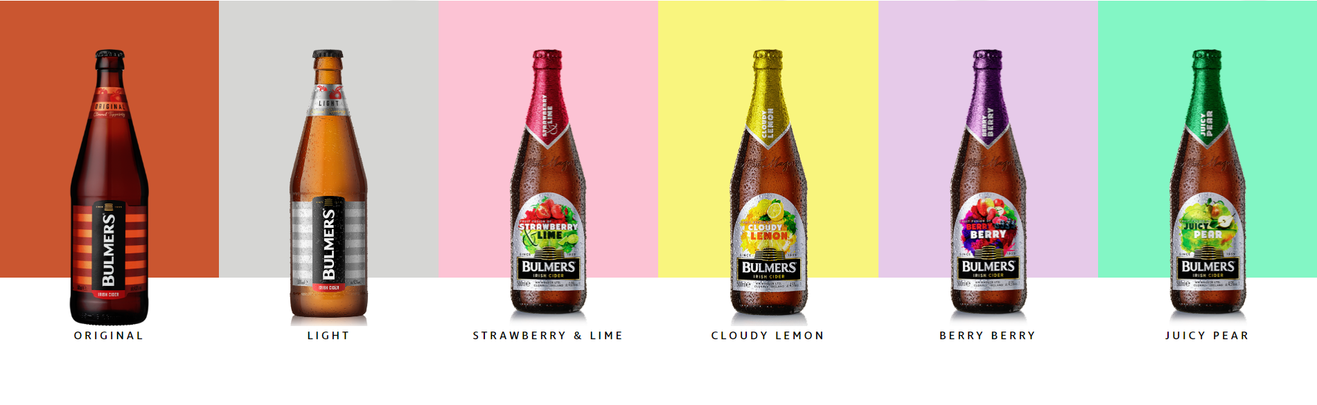
Here is an even more exaggerated example from an international level. This Bulmer Original Cider brand refresh has just arrived on shelves even though it was released in 2011.
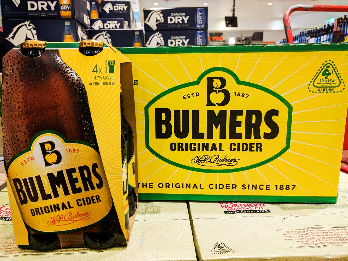
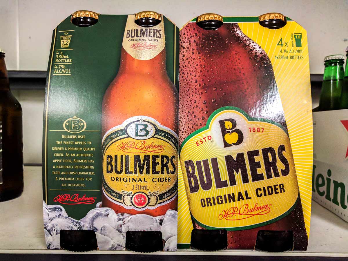
The "new" packaging and brand alignment is a significant pivot towards boldness and modernity. The canary yellow, crisp and vibrant describing the taste with an outline of green to signify the apple flavour. The colours do seem to direct more towards lemon than apple, reinforced by the subtle background line work, which would be the only disadvantage to the design. The logo refresh is more individually relevant to the drinks brand as an apple cider, and the general layout of the label is a lot less cluttered, adapting to modern audiences.
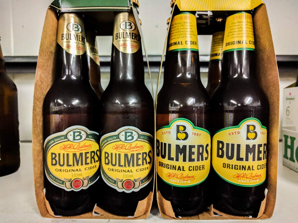
The label carries across elements from the previous to keep consistency which it accomplishes smoothly. The layout of the bottle label has also seemed to have further iterations. These solidify the composition further by keeping a high contrast with the yellow using stylistic elements such as shadows and outlines, accented in a gold foil. The refinement improves on the confusion in flavour by taking away the starburst background, although there is only the negative space apple in the logo mark to indicate further.
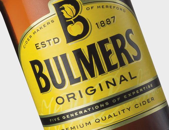
The redesign has given a prompt to H. P. Bulmer Bulmers Original direct competition, C&C Group Bulmers Irish Cider for their own redesign. Both brands are using colour as their main element to draw attention, with C&C being a little more conservative. Each showing refinement and confidence in their brands.
Further Reading