
![[REVIEW] Baily & Baily Label Release](/content/images/size/w1000/2019/03/BWSUpdate-1.jpg)
[REVIEW] Baily & Baily Label Release
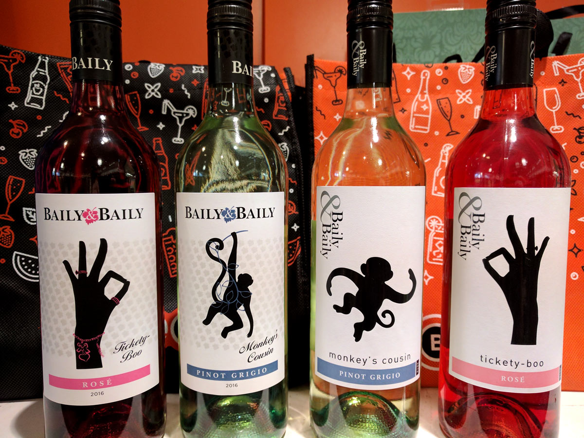
Baily & Baily stock came into BWS Wangaratta mid March with a new label, exhibiting new finishes and a slight logo refresh. The logo switched the oversized ampersand for a more subtle white space element inside a grape vine leaf, incorporated into the logotype that has been set to smalls caps on a single baseline. This change adds a more prominent hierarchy to the brand title, that is also sometimes said a "Baily Baily" leaving the ampersand out entirely. This abbreviation is common in Australian culture making interaction more informal, more friendly and relaxed.
The label elements of the Baily & Baily silhouette range have been changed more dramatically, adding a grey background pattern of the grapevine leaf with a UV gloss finish for added texture. The label title changed from a legible sans typeface to a condensed script restricted to two lines and aligned to the right, overlaying the background pattern. The main focus of the silhouette range was the solid black image, giving the bottle a sense of refined style. This has been built on with additional stylistic elements including a more complicated form and colour accents.
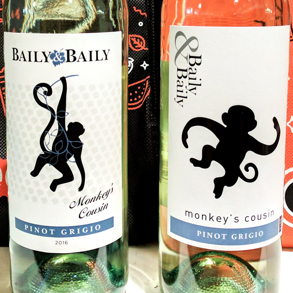
The changes made to the label rearrange the hierarchy of the elements given preference to the brand and title over the image. This is a strange decision given the array of distracting marketing materials and conflicting components of other labels on the shelf. The image gave a solid reference point when customers search for the brand and it stands out to browsers.
The label could be more accessible to the desired demographic, but the allure of elegance for the price-point seemed to be a more strategic tactic.
Some customers when given the choice did prefer the minimal design over the more baroque design. Though a small range focus group doesn't allow sufficient data for enquiry.