
![[REVIEW] Carlton Dry Packaging Update](/content/images/size/w1000/2019/03/BWSUpdate2_1.jpg)
[REVIEW] Carlton Dry Packaging Update
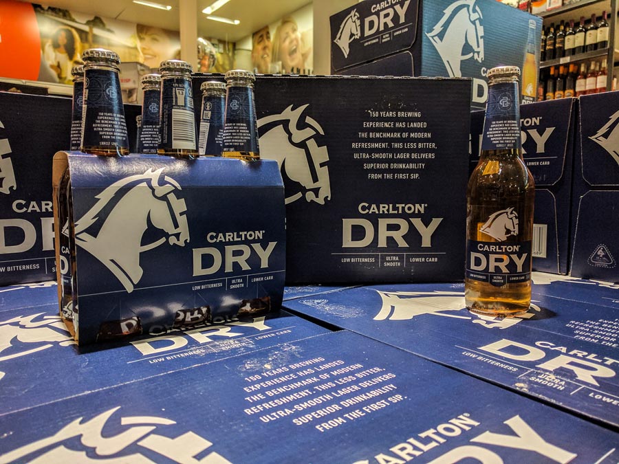
The Carlton Brewing Company has brought a refreshed look to one of their top sellers, Carlton Dry. A pared-down design brings the brand a modern and focused look that is keeping up to date with current market trends.
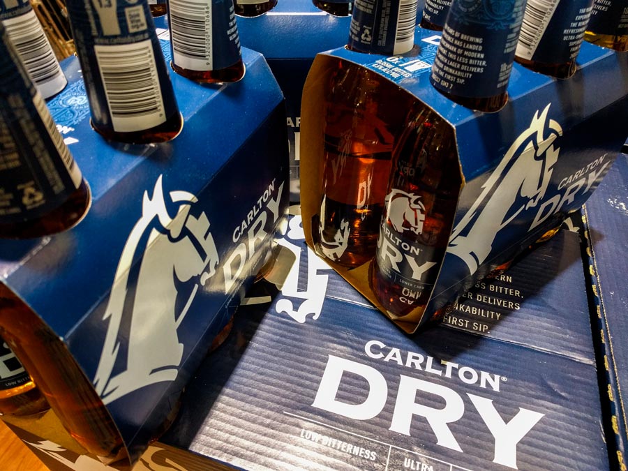
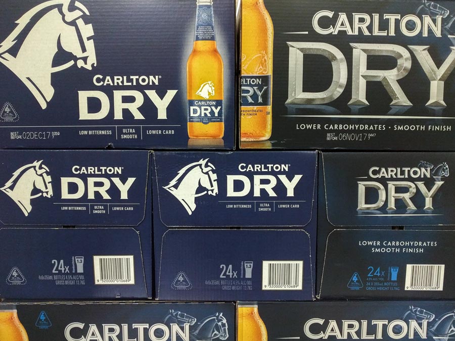
The old design has some elements from older trends, such as surface reflection and a grungy background texture. The sharp 3D lettering has aged well, though the low contrast of the print isn't as bold as other brands on the shelf. The bright blue with high contrast white is eye catching enough to attract customers searching for it and entice new partakers.
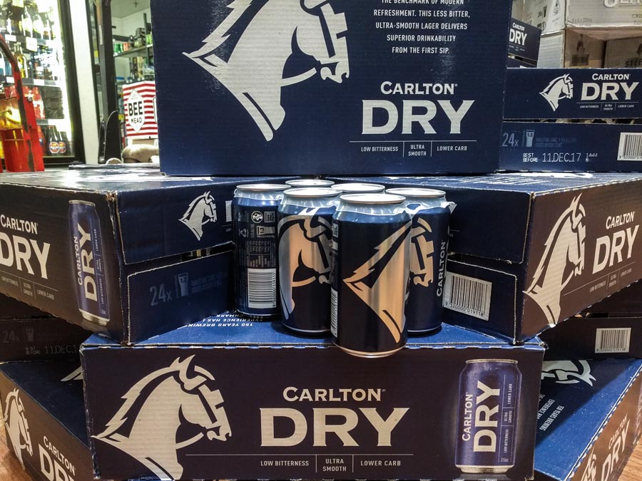
The functionality of the redesign is also an interesting avenue to explore. While the carton prints are still CMYK with spot due to the bottle render on the front. Other packaging like the 6-packs and cans are duo spot colours. The cans could be reduced to one spot colour though retaining the white ink instead of using the cans aluminium could be related to industry regulated labelling or simply as a safeguard for legibility or bar-code scan-ability. The large horse-head logo is however left as bare aluminium.
There is some speculation as to the thickness of the board used for the boxing, though sources haven't been found for comparison. Overall a great design regarding both aesthetics and functionality.
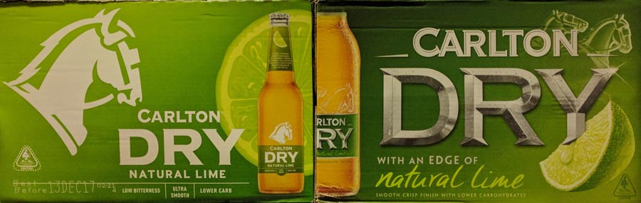
UPDATE:
During April the brand refresh has extended to the Carlton Dry and Lime variety. Showing consistency with the Carlton Dry brand, with a zesty green colour and half-cut lime imagery.